CHAPTER 8
Facts and figures on home ownership
Homes account for 43% of Australian household wealth. This means that homes should be 'front and centre' in any comprehensive financial plan.
This article examines the key facts and figures regarding home ownership in Australia. The article discusses the overall prevalence of home ownership, before examining some particular demographic features, such as age and gender. Housing affordability is discussed, as well as the effect of inflation on house prices. Finally, the impact of population and GDP growth on house prices is discussed.
8.1
Overall Prevalence
According to the Australian Housing and Urban Research Institute:
"Home ownership is the most common and most desired form of housing in Australia. The 2011 ABS Census recorded that 67 per cent of Australian households are owner occupiers. The number of households who own their home outright has fallen since 1996 (Census of Population and Housing 2015.0 1996) from 40.9 per cent to 32.1 per cent, while the number of households who own their home with a mortgage has increased from 25.5 per cent to 34.9 per cent (ABS 2011 Census QuickStats)."
According to the ABS, and as reported in Business Insider, this prevalence rate has been reasonably constant since the early 1970s:

8.2
Demographic Profiles - Gender
In 2012, three South Australian researchers (Kupke, Rossini and Yim) examined the issue of home ownership for women. Their research revealed much useful information, including the following:
- 36% of single mothers achieve home ownership;
- 44% of single fathers achieve home ownership;
- 62% of single women without children own their own home;
- 52% of single men without children own their own home;
- Over 80% of couples without children own their own home;
- Over 75% of couples with dependent children own their own home; and
- 5% of sole parent households are led by a woman.
Single parent families (described as 'single mothers' and 'single fathers' above) are those within which a child spends more than 65% of his or her time with that parent. By contrast, shared care is where the children spend more than 35% of their time with each parent (or no more than 65% of their time with one parent).
Single parent families account for somewhere around 77% of all families in which the parents are separated (we have to say 'around' because the AIFS data is now somewhat dated). Given that 88.5% of single parent households are run by a single mother, this means that around 67% of separations result in single mother households in which the mother provides at least 65% of the child care.
In summary, we know the following when it comes to women and property:
- Women earn less than men;
- Notwithstanding this, single women are more likely than men to buy property;
- Couples have high rates of homeownership;
- Upon separation, 2/3rds of women end up as the main carer (the 'single parent') for their children;
- Single parents have much lowered rates of home ownership (36% for women, 44% for men); and
- Single mothers who do own homes own cheaper homes.
So, the data is clear: women are more likely than men to own property - unless they are single mothers, which has a serious impact on their ability to own a home. Men are less likely to own property than women - unless they have a woman as a partner. Single fathers also struggle with home ownership.
8.3
Demographic Profiles - Age
While the overall rate of home ownership is relatively unchanged since the 1970s, there has been substantial changes for some groups of people. A particular variation that has been observed over the last thirty years is that home ownership is happening later in life. In June 2015, writing an excellent piece on The Conversation website, respected researchers Gavin Wood and Rachel Ong provided the following data:
Home ownership rate 1982-2011, in percentage terms
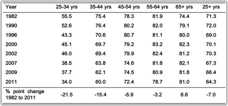
(Source: The Conversation, June 12 2015).
As the table shows, the rate of home ownership has fallen by 40% for people aged 25-34 and by 20% for people aged 35-44 in the 30 years to 2011. (It should be noted that the total figure of home ownership for people aged over 25 is lower in the Conversation piece than it was in the ABS and AHURI data.)
Conversely, the rate of home ownership for people aged over 65 has increased by just over 10% over the same period.
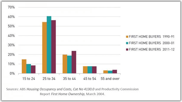
So, people are buying homes later in life. This finding is echoed by the data provided by SGS Economics and Planning, who report the following:
"Over the last two decades, the proportion of first home buyers aged 15 to 24 has declined steadily from around 15% to 8%, and the average age of first home purchase has increased slightly from 32.7 to 34.0 years (see Figure 1).
Figure 1: first home buyers by age group (%)
Many commentators seem to imply that the postponement of the first home purchase is all down to housing affordability (see below for a discussion of affordability). For example, here is what the ABC website had to say in October 2014:
"A report by website, realestateview.com.au says more than 60 per cent of first home buyers are now married and having children before they can afford to buy their first home."
Given the average cost of a wedding in Australia is now $36,000, and that the cost of having children has never been low, this conclusion is highly dubious: it is very unlikely that people become more able to afford homes after they get married and have kids. What is much more likely is that people are simply experiencing most 'milestone' events later in life, and buying a first home is no exception. For example:
- The number of school students leaving school after year 12 has risen from approximately 33% in 1980 to about 80% in 2012;
- People are spending more time in tertiary education, as well: In 2011 the percentage of the population aged 15 and above with a Bachelor's degree or higher (18.8%) was over nine times the figure for 1971(2%);
- People are leaving home later: In 2006, almost one in four (23%) people aged 20-34 years were living at home with their parents, compared with 19% in 1986:
- In 2010, the median age at first marriage for men was 29.6 years and 27.9 years for women, an increase of more than three years since 1990 (26.5 years and 24.3 years respectively);
- the median age at which women have their first baby has risen from 27.5 years in 1990 to 28.9 years in 2010;
- People are even divorcing later in life: In 2010, the median age for males at separation was 40.8 years, and 44.4 years at divorce, up from 35.3 years and 38.2 years respectively in 1990.
So, people are doing everything later in life - including buying their first home.
8.4
Housing Affordability
Housing affordability is typically calculated by examining house prices as a function of income or by examining the proportion of the purchase price of homes that is financed by debt. Over the 20 years to 2011 (the most recent data we have available), housing affordability undoubtedly fell when measured by this second measure:
Mean mortgage debt to income ratio
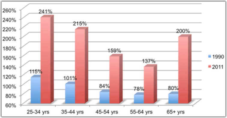
(Source: The Conversation, June 2015).
That said, it is also undoubtedly the case that the cost of servicing these higher debts has fallen. On June 30 1990, the RBA target cash ratewas 15%. On June 30 2013, the rate was 2.75%. Adding a three percentage point margin for retail lending, this suggests home loan interest rates of around 18% in 1990 compared to 5.75% in 2011. This implies a 68% reduction in interest expense for a given level of borrowing. In turn, this suggests that the mean mortgage to debt ratio would need to have increased by around 310% for the actual servicing burden in 2013 to have been the same as it had been in 1990 - something that readers who can remember the interest rates that prevailed in the late 1980s will remember only too well.
For example, in 1990 a borrower in the 25 - 34 year age bracket borrowed 115% of their annual income to buy property. This implies an annual interest expense equal to 20.7% of their income (18% interest times 115% debt). In 2011, the same type of borrower borrowed 214% of their income. This implies an interest expense of 13.9% of annual income (5.75% times 241% debt). So, while people are borrowing more, servicing their debt uses less of their income than it did in 1990.
8.5
The effect of inflation on house prices
One thing that is often forgotten in analyses of housing prices is the impact of inflation. When inflation is adjusted for, the resulting price is known as the real price of housing. Analysis produced by Cameron Kusher of property researcher Core Logic in June 2014 included the following observation:
"In non-inflation adjusted terms home values are higher than their previous peak in: Sydney, Melbourne, Canberra and Perth. Once you account for inflation, Sydney is the only city where values are currently higher than their previous peak.
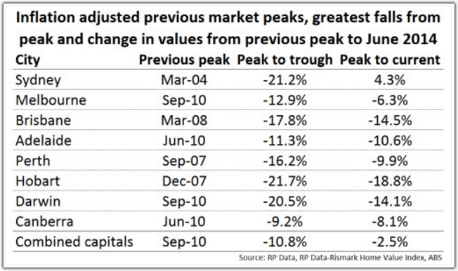
This analysis suggests that (as of June 2014), real house prices had fallen since at least 2010 (the common peak for inflation-adjusted house prices) everywhere other than Sydney. Many observers of housing prices would be surprised to hear that prices had fallen - in real terms - since 2010. Provided that incomes had at least tracked inflation, this means that affordability had improved everywhere other than Sydney over that period.
(Note: the same researchers tell us that prices have risen since mid-2014 in all major cities).
8.6
Drivers of Growth in Housing Prices - GDP and Population
Much of the increase in housing prices is explained by the simple fact of Australia's rising population and our rising GDP per capita.
Population
The populations of Australia's largest cities has increased substantially over the past 40 years. The ABS reports the following (more recent data is not yet available):
"Sydney and Melbourne had the largest growth of all capital cities between 1973 and 2013, both adding around 1.7 million new residents to their populations. Earlier in this period, Sydney grew at a faster overall rate than Melbourne, but since 2000 Melbourne has increased more rapidly. For the total 40 year period, Melbourne increased by 62% while Sydney increased by 54%.
Brisbane and Perth have also had large growth, both increasing by around 1.2 million people. This is an increase of 152% for Perth, and 124% for Brisbane.
The four largest capitals (Sydney, Melbourne, Brisbane and Perth) had 89% of the total capital city growth between 1973 and 2013. In 2013, 87% of all capital city residents lived in these cities. However, Darwin had the fastest growth of all capital cities, increasing by 191% since 1973. Perth (up by 152%), Brisbane (124%) and Canberra (120%) were the only other capitals where population more than doubled."
Much of this growth was immigration based. Net overseas migration has been positive every year since the 1970s, with the rate of arrival in every one of the past ten years exceeding the previous peak in 1990:
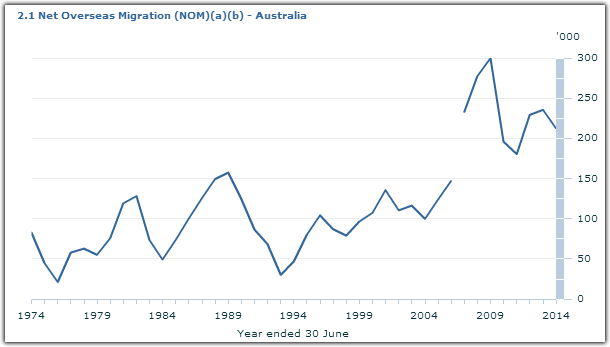
(source: ABS. A year of data is missing).
GDP
GDP growth per capita was even more pronounced. (Per capita means per person.) The website Trading Economics demonstrates this with the following graph, charting a tripling in per capita GDP between the early 1960s and recent years:
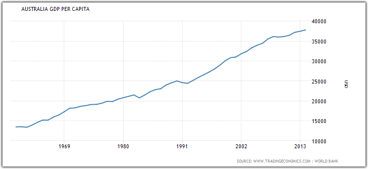
Taken together, these data show that there are substantially more Australians living in our major cities and those people are sharing in much higher rates of GDP per capita than has previously been the case.
These two factors are undoubtedly driving much of the increase in home prices that has been observed over the last thirty years.